Before describing the tools, I'll briefly explain why I think these tools could serve a useful function:
The characteristics of cultural-personal factors, and their effects on the process and content of science, are topics for hot debate among scholars who study science. When evaluating different viewpoints, especially the more extreme interpretations of science, such as those that claim a very high influence of "politics" in science, it helps to have tools which encourage flexible, critical thinking that is precise and accurate. This page describes two analytical tools, idealization and range diagrams, that may be useful in avoiding dichotomous generalizations and in clarifying the ways that science is (and is not) influenced by cultural-personal factors, in various situational contexts.
A. Analysis by Idealization
One approach to analyzing the characteristics and influences of 'culture in science' begins with idealization. Just as Newton tried to imagine the characteristics of "motion without friction," we can try to imagine the characteristics of "science without cultural influences." By comparing this idealized science with actual science, we can estimate the influence exerted by various types of cultural factors, and how these affect the process and content of science, in the short-term and over longer periods of time. The logic used in this idealization process is described in Section 2.26-E {note to reader: This page was part of my PhD dissertation, in Section A25 of its Appendix, thus the references to sections}; when a simplified model that is known to be false because it omits a known component (in this case, cultural-personal factors) serves "as a 'control' for determining the effects of components that have been omitted or oversimplified."
In doing an idealization, great care should be taken with the selection of cases to study. Because the amounts and types of cultural-personal influence vary from one situation to another, it is important to ask whether the selected cases accurately represent a larger population of situations (for science as a whole, or for specialized fields) and how they fit into the 'big picture' of science and scientists.
In certain cases, with certain interpretations of science, idealization may seem easy. But with other cases or interpretations, the conclusion may be that some aspects of science -- especially some foundational 'thought style' beliefs -- are so intimately intertwined with some aspects of culture that it is difficult to separate the science and culture from each other. Either way, the process of attempted idealization could be instructive.
Perhaps one of the most instructive aspects of this process will be the attempt to idealize. How does one try to imagine what science would be like, in a certain field, without the thought style that operates in this field? When a component of a thought style is essential for doing science, how does one define what this component -- and the resulting science process and content -- would be "without cultural influence"? Doing this thought-experiment skillfully requires a great deal of careful thinking, and this thinking may be the most important part of the process. One strategy for characterizing a thought style is to imagine several models of science, each with a different type of thought style, and then compare the predictions of these models with each other, and with what really happened in the situation being studied. { In Section 2.26-E this strategy is described using damping force, rather than thought style, as the component that is being varied from one model to another. }
The goal of this 'analysis by idealization' would be a deeper understanding of the characteristics and functioning of cultural-personal factors and thought styles, and how these affect the process and content of science. Of course, this understanding would also be informed by the scholarly work of historians, philosophers, sociologists and psychologists, and by models such as the interpretive framework described in Section 2.32.
One of the most valuable functions of analysis (whether it is done by idealization, by making range diagrams, or with any other technique such as those typically used by study-of-science scholars) is to encourage a study of specific cases. Hopefully, these 'reality checks' will reduce a human tendency toward simplistic generalizations and dichotomous stereotyping. With overly simplistic generalizing, pronouncements about "science" can ignore important differences. For example, the influence of societal politics spans a wide range, from a psychologist studying sociobiology (this can be very politicized and controversial) to a chemist studying the kinetic effects of groups attached to a benzene ring (there is not much 'politics' evident here).
B. Analysis using Range Diagrams
One of the most useful parts of the ISM framework is its flexible language, carefully designed to avoid the need for rigid dichotomous thinking. For example, Section 2.43 describes a set of terms (including truth status and utility status) designed to encourage flexible thinking about the goals of evaluative conclusions. Similarly, this subsection describes a set of diagrams designed to encourage flexible thinking about the influence of cultural-personal factors in the process and content of science.
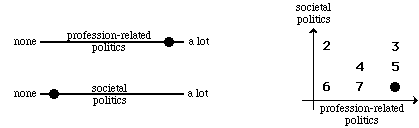
The left side of Figure 11 shows the simplest type of range diagram, a continuum. In the example shown, the range is from "none" to "a lot." The top diagram shows that, for an imaginary science situation, the estimated amount of 'profession-related politics', shown by the dot, is fairly high. The dot on the bottom continuum shows that for this situation the estimated amount of 'societal politics' is low.
The right side of Figure 11 shows a second type of range diagram, a two-property graph, that is made by combining the estimates that are made on two continuum graphs for seven imaginary science situations. The dot shows that, for the science situation shown in the continuums on the left side, the amounts of profession-related politics and societal politics are high and low, respectively. When abbreviated using a math convention of listing the x-variable first, followed by the y-variable, the first situation is "high/low." In situation #2 the profession-related politics and societal politics are estimated to be low and high, respectively (low/high); the other five situations are, in order, high/high, medium/medium, high/medium, low/low, and medium/low.
Figure 11: Two Types of Range Diagrams for "Politics in Science" (with imaginary analysis)
continuum graphs: a two-property graph:
These graphs can also be used "in reverse" to stimulate thought-experiments; for each of the seven dots in the two-property graph above, try to imagine a corresponding situation. This might stimulate thinking about correlations between the two types of politics. For example, while imagining dot #2 I became aware of a potential asymmetry in causal relations. I can easily imagine situations such as #1 where profession-related politics has little to do with societal politics. For #3, I can imagine situations where both types of politics overlap and intermingle, with each helping to produce and support the other, with high degrees of both getting mixed together in a mutually supportive blend. It is more difficult to imagine #2, with societal politics active in science, but with no corresponding manifestation in profession-related politics. This theory about #2 may be wrong, but it seems to be an idea worthy of pursuit, and I had never formulated it explicitly until I drew Figure 11 and thought about the meaning of each dot.
The preceding paragraph should serve as a reminder that ideas can serve many functions. Range graphs could be used as initially described, by starting with empirical data and using this data to construct one or more types of graphs. Or, as in the thought-experiments just described, a range diagram can be used to stimulate ideas. Or a diagram could be used as a pedagogical tool, to help students or colleagues understand an idea, or to persuade them of its plausibility or utility. The diagrams described in this section should be considered only a starting point for developing this type of analysis, not a final formula for a polished technique.
One variation is to expand a two-property graph to three properties. There are a number of ways this could be done. If the third property is easily 'split' -- for example, by splitting scientists into those who study sociobiology, benzene chemistry,... -- a two-property graph (as in Figure 12) can be drawn for each, to show the similarities and differences between different fields in science. Or, if situations can be split into those having a low, medium or high value for the third property, a separate two-property graph could be drawn for the situations that fall into each of these categories. Or just draw a 3-dimensional graph for the three properties. If the analysis gets too complicated (such as a graph with 4 dimensions), the principles learned from do-able range graphs can be extrapolated into more complex analyses where a literal drawing is not feasible.
Another possibility is to split Figure 11, for politics in science, into two parts -- for the effects of politics on science process and on science content. Or perhaps these could be further split into effects that are short-term and long-term.
Or, moving in the direction of simplification, a two-property graph can be converted into a 2x2 matrix with 4 cells, for the dots at each of the four corners; in Figure 11, these are 2, 3, 6, and 1. Or, if each of the properties is split into three categories (for low, medium, and high) this will make a 3x3 matrix with 9 cells.
Figure 12 shows a third type of range diagram, a frequency graph. The first graph shows estimates based on an imaginary analysis that agrees with my own views for "science as a whole." This graph shows, for imaginary selected situations, that the frequencies for profession-related politics range from none (at the left end of the graph) to high (at the right end of the graph); the frequency peaks at a medium-high amount of societal politics, and decreases on either side. In the second graph, the frequency peaks at a low amount of politics. A comparison of these two graphs shows that the imaginary person doing the estimates thinks (in agreement with myself) that profession-related politics is more frequently a significant factor in science, compared with societal politics.
Figure 12: Frequency Graphs for "Politics in Science" (for imaginary analysis)
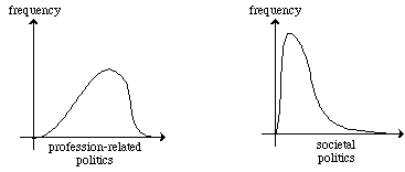
Figure 13 shows another way to summarize frequency-information. Instead of using a frequency graph (as in Figure 13), Figure 14 begins with a continuum, and then conveys a quick-and-rough idea of relative frequencies by shading the parts of the graph where frequency is highest. For interpreting this graph, it may help to imagine that the most heavily shaded areas have more 'dots' of the type used in Figure 11.
Figure 13: A Method for showing Approximate Frequencies (for imaginary analysis)
![]()
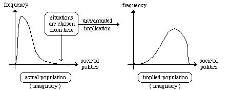
Figure 14 shows the unwarranted implications that occur when the situations selected for analysis are not an accurate representation of the entire population. For example, if the only situations that are studied involve a high degree of societal politics, this biased sample does not accurately represent the entire population which, as shown in the left-side frequency graph for the "actual population," contains many situations in which societal politics is low. But the "implied population" contains a much higher frequency of high-politics situations, because it has been inductively generalized from a sample that is biased in favor of high-politics situations.
Figure 14: Unwarranted Implications occur if Examples do not
accurately represent Population (for imaginary analysis)
As with idealization, in using range diagrams the goal would be a deeper understanding of cultural-personal factors and their functioning in science. For example, careful examination might show -- as I suspect it would -- that profession-related politics occurs more frequently (and more obviously) than societal politics. And while some components of thought styles, such as the choice of metaphysical assumptions, can have enduring long-term effects, many cultural factors will exert influence that is only short-term. For example, preferences for posing certain types of problems may delay the investigation of non-preferred domains or the development of theories in these areas, but it probably won't shut scientists out of these domains forever.
OTHER PAGES:
If you like this page, you may also like the following related pages:
| Hot Debates about The Nature of Science Cultural-Personal Factors in Science • a sitemap for Thinking
Skills in Education: A Grand Tour of Learning, Teaching,
Thinking Motivations (and strategies)
for Learning Aesop's Activities for
Goal-Directed Education An Introduction to Design Method This area of Thinking Skills has sub-areas of Productive Thinking (Skills & Methods) Creative Thinking Critical Thinking |
This page, written by Craig Rusbult, has a URL of
http://www.asa3.org/ASA/education/science/range.htm